
This guide is for first time users of Power BI who have already activated and installed Power BI. If you have Power BI activated but have not yet set it up yet, please see our FAQ How do I install Power BI? first.
If you are not a Power BI user and are interested in getting Power BI for your support team, please reach out to your Account Manager or to success@helpshift.com. To learn about the benefits of Power BI, please see How can I get more out of Helpshift Analytics with Power BI?
1. Overview and Key Terms
For the latest information on the layout of Power BI, please review the first section of Power BI basic concepts documentation via Microsoft. The very first section covers the dashboard layout and main features.
Some key terms from this documentation include:
Datasets: a collection of data that you import and connect to. The work that you do in Power BI doesn’t change the underlying dataset. Your Helpshift dataset is used to create the visualizations that you see.
Report: one or more pages of visuals which all come from the same dataset. The multiple tabs at the bottom of your Helpshift analytics dashboard contain individual reports.

Dashboard: In Power BI, a dashboard is a single canvas that contains tiles and widgets. Tiles display visualizations, which are defined below.
Dashboards are a great way to share reports between people inside and outside of your organization. You can add tiles to your dashboard in a variety of ways. To learn more, see Dashboard tiles in Power BI.
Power BI can have more than one dashboard. As you add more dashboards, these new dashboards are added to the list under the dashboards heading.


2. Basic Functionality
The following basic functions allow you to review and get the most out of all of the data available to you via Power BI.
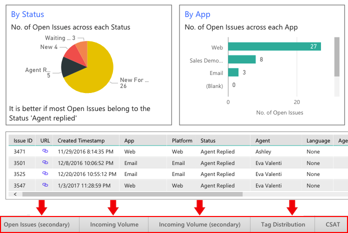
As mentioned above, you’ll see a series of tabs at the bottom of the page. Each of these tabs links you to your different reports. Click on any tab to navigate to that report.


For each of your visuals, you can see more detail by clicking the ‘expand’ button on the top right side.

This will open up the visual into a larger view to see more detailed metrics. You can also highlight visuals from this area, which is explained later in this guide.
3. Highlighting and Filtering Data
Highlighting data allows you to select a subset of the data to view by a specific value. The visualizations on a single report page are all ‘connected” to each other, which means if you select one or more values in one visualization, other visualizations that use that same value will change based on that selection. Essentially, this will highlight a subset of the visual data; the un-highlighted data remains visible but dimmed.

Select any empty space in the same visual to remove it.
To sort data, click on the ellipses in the top right corner of any visual, then select a ‘Sort By’ option.

4. Exporting Data to Excel
In Power BI, you can export any visual or dashboard.
To export your data, select the ellipses (three dots) in the top-right side of any visualization and choose the Export data icon. Your data is exported as a .csv file. You can save and open the file in Excel. See Export data from Power BI visualizations for more information.

5. Creating Dashboards
You create dashboards by pinning visualizations from reports that you authored and published using Power BI Desktop, or visualizations you created within the Power BI service itself. For step-by-step instruction, please see Microsoft’s documentation Create and configure a dashboard.
When you first create a dashboard, it will be empty. You can add content to your dashboard by pinning visualizations. Pinning a visual to a dashboard is a lot like pinning a picture to a corkboard on a wall – it sticks the visual in a particular spot for others to see.
These pinned visuals are called dashboard tiles and they can be created from a report, dataset, dashboard, Excel, and from SQL Server Reporting Services (SSRS).
You can also add standalone content to your dashboard. Use Add tile to add an image, text box or heading, video, or web content to your dashboard.

An easy way to pin more than one visualization at a time is by pinning an entire Helpshift report page to your Power BI dashboard. When you pin an entire page, the tiles are live, which means you can interact with them like you would in your actual report. Any changes you make in your report like adding a filter will be reflected in the report. Please read Pin an entire report page, as a live tile, to a Power BI dashboard for more information.
You can also read more about dashboard best practices at Tips for designing a great Power BI dashboard.
6. Editing Reports
You can create and edit your own customized reports in addition to the reports we have shared with you. This is an advanced feature, but it allows for a higher level of flexibility in reporting. You can create a new report either from your Helpshift dataset or from your existing Helpshift reports. Please see Microsoft’s documentation Create a new report from an existing report for step-by-step instructions.
There are two main ways that you can interact with your data in Power BI: Reading View and Editing View. In general, you will use Reading View most often to interact with your reports.
Reading View: This is great way to interact with data without changing the underlying report. If you share reports with other members of your team, they’ll only be able to view this data in Reading View.
Editing View: In this view, you have lots of flexibility in exploring and designing a report. All of the Reading View functionality is available in addition to these extra features. Editing view is best for once you have gotten the basics out of your data with Helpshift and Power BI and want to see what else you can do.
To learn how to change views, please see Microsoft’s documentation on Steps to go from Reading View to Editing View.
Once you have created a new report, you can add visualizations in Editing View with the report editor panes on the right-hand side of your dashboard.

To learn more about different ways to create, edit, and format visuals, please see Add visualizations to a Power BI report.
Once you’ve added new visualizations in your report, you can pin them to your dashboard. To pin the visualization, select the pin icon.

7. Additional Resources
When working with your Helpshift data in Power BI, you have access to Power BI’s wide range of documentation. Some pages you’ll want to review include:
To set up additional features and learn more about Helpshift best practices, please review our Knowledge Base.