
Modern designs can help to bring a professional look and feel to your product support operations, as well as an improved user experience.
The advent of SDK X brought with it an updated Helpshift chat service for support messaging. More recent look-and-feel changes to the chat service arrived on June 15, 2021, with advanced control over many aspects of the chat UI.
NOTE: Helpshift customers whose subscriptions predate June 15, 2021, can upgrade their web chat widget embed code from a legacy version to the current implementation.
Updating the widget is as simple as obtaining and using the embed code that your Helpshift instance makes available at: Settings > APP SETTINGS | {app} > [Web Chat card] > Embed code.
Use the new embed code to replace the legacy embed code on your website. Upgrading to the 2021 experience is optional, initially. However, Helpshift plans to migrate all customers to the latest chat look-and-feel for support messaging on Aug. 15, 2021.
Branding and Customizations
Features on the Branding and Customizations page help you configure color options for standard chat UI elements. As shown in Figure 1, we even include a system-default (“preset”) color scheme for your convenience, which you can, of course, overwrite at any time with your preferred color palette.
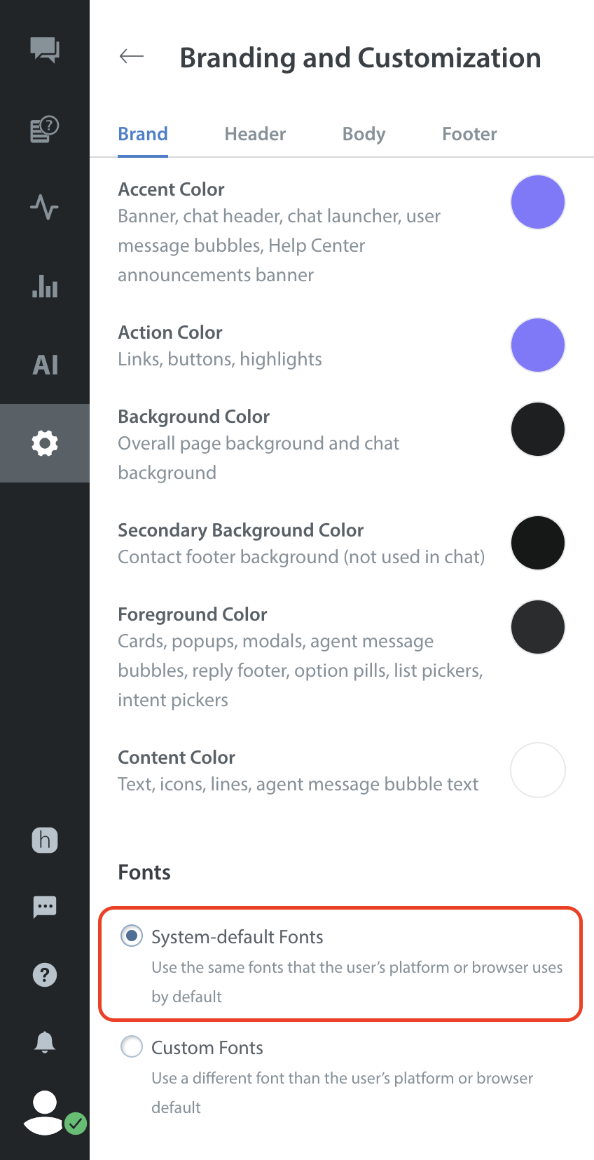
Figure 1 — Color presets
Figure 2 illustrates the appearance of Helpshift color presets on the chat UI in a desktop browser.
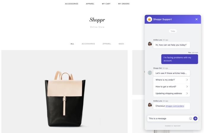
Figure 2 — Desktop browser look-and-feel
By setting just five* basic colors on the Branding and Customization page, you adjust the appearance of more than 20 chat UI regions and elements.
- The saved ‘Accent Color‘ applies to banners, headers, the chat launcher button, and end-user message bubbles.
- The saved ‘Action Color‘ applies to links, buttons, and highlights.
- The saved ‘Background Color‘ applies to the overall page and chat backgrounds.
- The saved ‘Foreground Color‘ applies to banner text, cards, popups, modals, agent message bubbles, bot message bubbles, the chat widget reply footer, clickable option “pills,” list pickers, and intent pickers.
- The saved ‘Content Color‘ applies to message text, icons, lines, and agent message bubble text.
NOTE: Our chat UI does not make any use of the “Secondary Background” color.
- Some chat UI elements use one of your saved colors as a tint, applying it with less than 100% opacity.
- In addition to its color-related settings, the Branding and Customizations page includes settings for your use of logos, banners, images, favicons, and fonts.
Figure 3 shows the effect of colors on various chat screens and UI elements — any of which you can recolor to match the brand identity of your product or company.
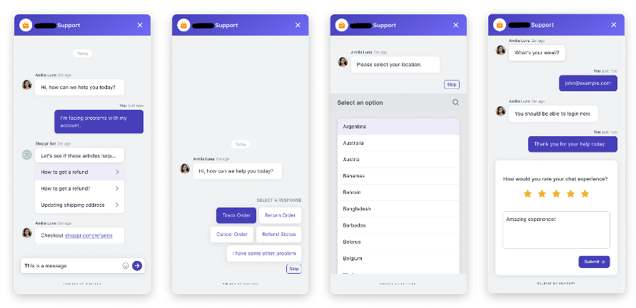
Figure 3 — Chat widget screen samples
Color affects the appearance of the chat frame
The visual border that surrounds and loads behind all other elements in our chat UI is called the chat frame.
The chat frame look-and-feel can vary slightly, depending on where you view it. (See Figure 4.)
- In a desktop browser, it loads as a widget that covers only part of a standard web page.
- In a mobile browser, it fills the browser window.
- In-app on an iOS device, it fills the screen.
- In-app on an Android device, it fills the screen.
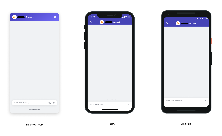
Figure 4 — Variable look-and-feel
Figure 5 uses Helpshift color presets to illustrate specifically where we apply various color selections to the chat frame.
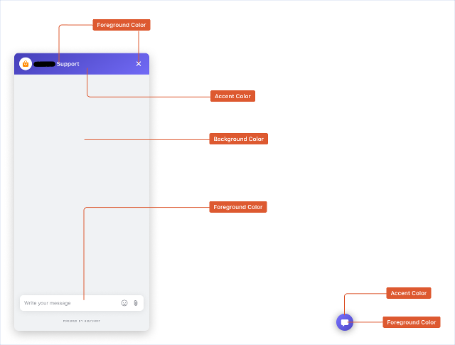
Figure 5 — Chat frame colors
Color affects the appearance of messages from agents and bots
Figure 6 uses Helpshift color presets to illustrate how we apply your color selections to the messages that bots and customer service agents send.
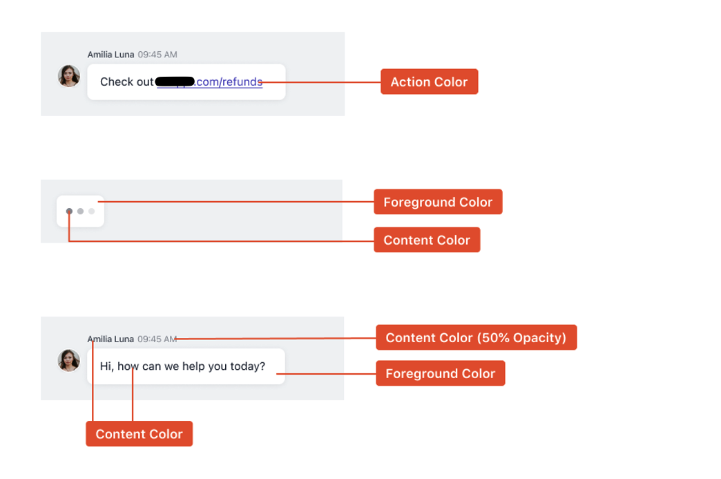
Figure 6 — Messages from agents and bots
Color affects the appearance of messages from end-users
Figure 7 uses Helpshift color presets to illustrate how we apply your color selections to the messages that end-users send.
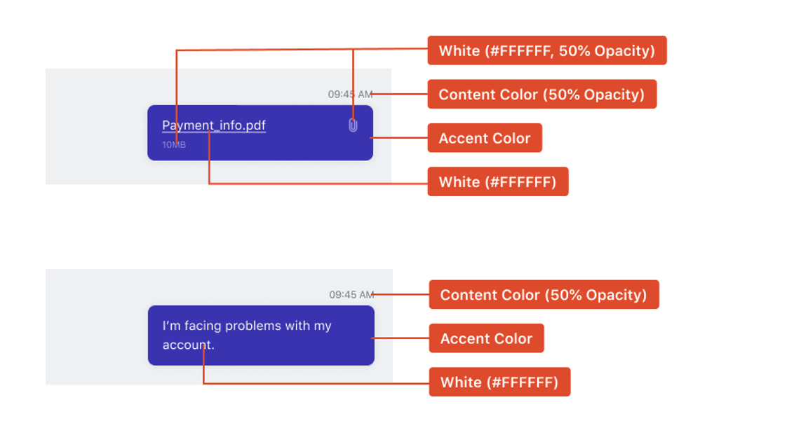
Figure 7 — Messages from end-users
Color affects the appearance of forms
Figure 8 uses Helpshift color presets to illustrate how we apply your color selections to a form that end-users see when:
- they try to chat with you outside the posted business hours for your customer service team
- they try to chat with you at any other time when no customer service agents are available
Output from the submitted form alerts your customer service organization that the end-user awaits their response.
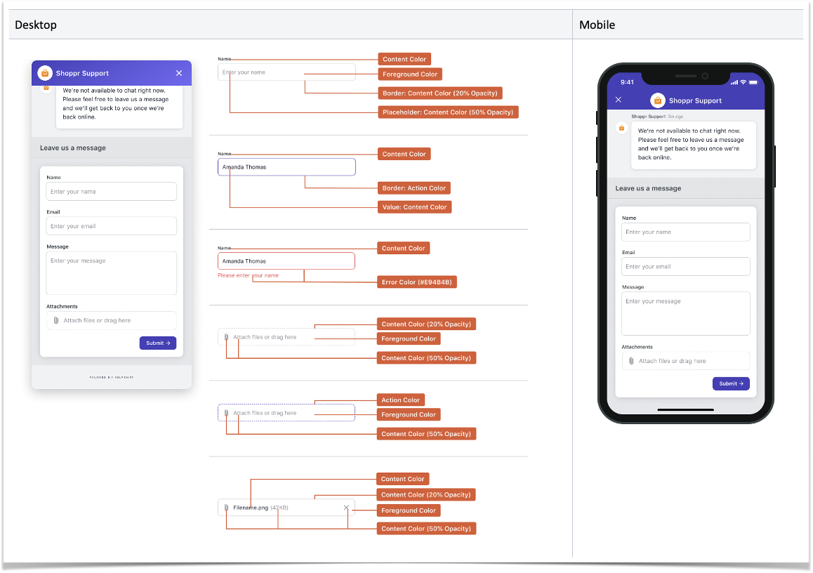
Figure 8 — Forms
Color affects the appearance of customer satisfaction (CSAT) surveys
Figure 9 uses Helpshift color presets to illustrate how we apply your color selections to CSAT surveys.
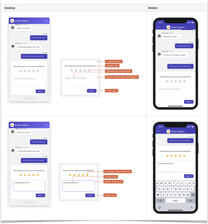
Figure 9 — CSAT surveys
UI element states can affect the color of lists and options
Figure 10 uses Helpshift color presets to illustrate how we apply your color selections to option “pills” before and after an end-user interacts with them.
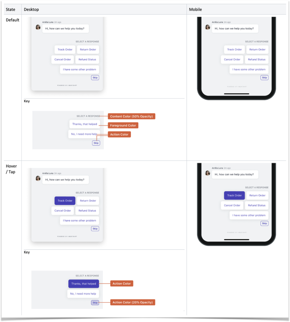
Figure 10 — Option “pills”
Figure 11 uses Helpshift color presets to illustrate how we apply your color selections to lists.
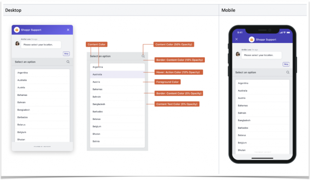
Figure 11 — List pickers
Understand the variable appearance of chat UI reply footers
Under certain circumstances, UI elements toward the bottom of the chat frame can vary in their appearance. For example:
- Elements may change color or opacity.
- UI coaching text may appear.
- An alphanumeric keyboard may appear.
- An emoji keyboard may appear.
Figure 12 uses Helpshift color presets to illustrate the conditional look-and-feel of chat UI reply footers.
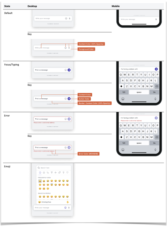
Figure 12 — Variable chat UI reply footers