Once you’ve enabled Custom Issue Fields for reporting in Power BI, you’ll see them become available in the Custom Issue Fields Mapping page of your Support Analytics report. When you click into the tab, you’ll see the Custom Issue Fields you have mapped in a table.
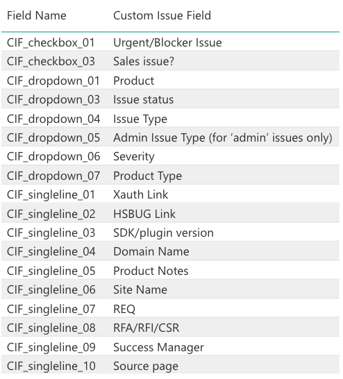
You can use Power BI to display your Custom Issue Fields data in a number of ways. In this FAQ, we’ll cover 2 examples to walk through the steps to creating custom visualizations that will be helpful for your support team to have access to.
Example 1: Use Custom Issue Fields in a Visual
In this example, we want to use Custom Issue Fields data within a visual so we can easily review a snapshot of the data, like in the screenshot below.
First, to enable editing of the report, click the ‘Edit report’ button at the top of the page.
![]()
Once you’re in edit mode, switch to the page in which you want to create the new visual using the bottom tabs.
You can also create a new page to hold these visuals by clicking the ‘+’ button.
Next, you’ll need to select the right visual to display this data. To add a new visual, click the ‘Edit Report’ button. This opens the list of visualizations and fields, where you can select the visualization you want to map data to from within the visualizations area.
For this example, we will select the ‘stacked column chart’ visual.
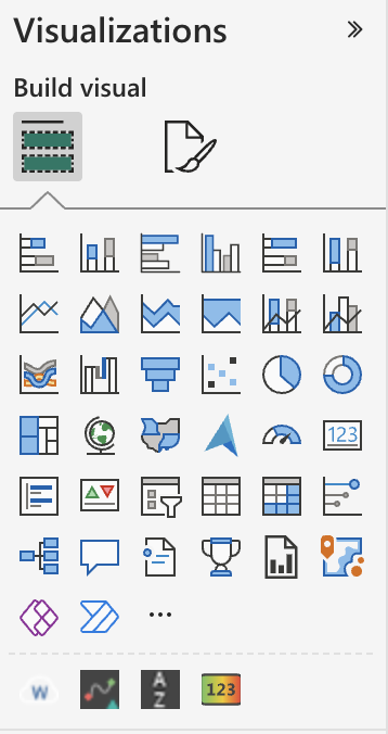
After you click the visualization, it will appear within the report as an empty visual.
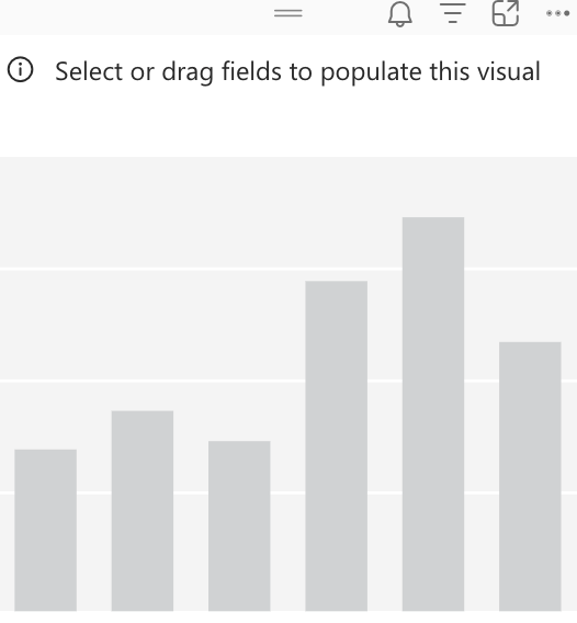
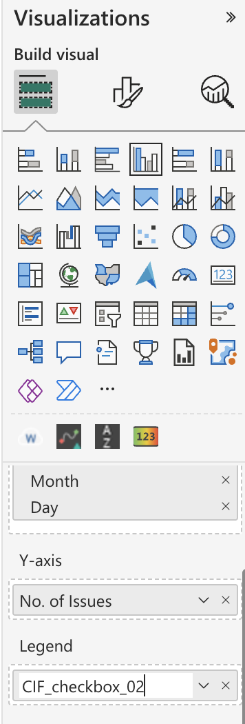
To add data to the visual, click into the table drop-downs in the ‘Fields’ section and select the checkbox next to the fields you’d like to apply to the report. You can also search for the field name.
For our stacked column chart, we want want the x axis to be ‘created date’ and the y axis to be ‘number of Issues’.
![]()
![]()
Power BI will automatically add the date field to the x-axis, and the value field to the y-axis.
You’ll see the axis placements listed in the ‘Axis’ section to the left of the list of fields.
By default, Power BI aggregates all the dates by creating a date hierarchy (Month, Quarter and Year). Accordingly, you’ll notice that the visual only shows years in the x-axis. Clicking on the double down arrow (↓↓) in the visual header will switch the x-axis to show Quarters (ex: Q1, Q2 etc.). Subsequent clicks will switch the x-axis to Month and then Day.
You can turn off “Date Hierarchy” using the ▼ icon next to “Created Date” in the below screenshot.
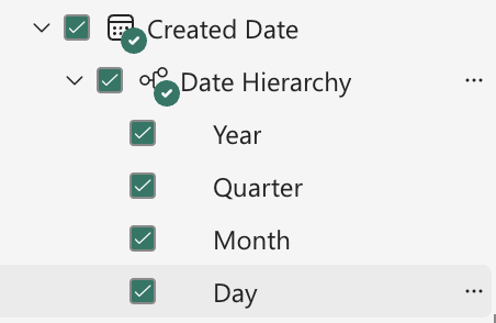
After you’ve selected the fields, the visualization will update to include that data. You can also hover over the data to review correlations, such as the volume of Issues on a specific date in our example.
To add the additional layers of data needed for this visual, navigate back to the list of mapped Custom Issue Fields to find the corresponding field name for the type of data you want added into the visual.

Once you have the field name, search for and select it in the ‘Fields’ area.
Select the field, which will directly add it to the ‘legends’ section. After you’ve done so, the new data will automatically appear in the visual.
You’ll notice that the visual is still using the generic name, which is ‘CIF_dropdown_2’ in this case.
You can update how the name appears by clicking the ‘Legends’ drop-down under the ‘Visualizations’ area, The generic name will be listed here, and can be updated in this text field.
You can also update the title of the visualization by navigating to ‘Title’ and updating the text field there.
To save this new report, click ‘Reading View’ and then confirm that you would like to save these changes.
![]()
Example 2: Use Custom Issue Fields to Filter or ‘Slice’ Data
In this example, we want to add a Custom Issue Field as a filter for data (known as a ‘slicer’ in Power BI).
First, to enable editing of the report, click the ‘Edit report’ button at the top of the page.
Once you’re in edit mode, switch to the page in which you want to create the new visual using the bottom tabs.
You can also create a new page to hold these visuals by clicking the ‘+’ button.
Next, select the ‘slicer’ icon in the visualizations screen. You can hover over the icon to make sure it’s the correct visual.
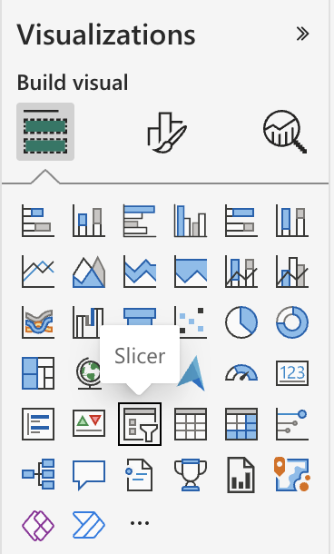
While this new slicer visual is in selection, select the Custom Issue Field that you want to use for it from the ‘Fields’ section in the right. For this example, we use the filters ‘No. of Issues’ and ‘CIF_dropdown_02’ (which we know from our list of mapped Custom Issue Fields correlates to the User Plan).
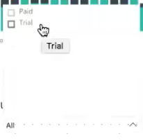
This populates the slicer with the ‘User Type’ data in list form. You can switch to the drop-down view of the slicer by clicking the ‘down’ arrow next to CIF_dropdown_01.
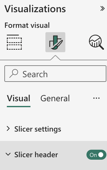
Slicers in Power BI have both a header and a title. Due to Power BI settings, you cannot edit the header for the slicer. However, you can hide it by navigating to the paint roller icon under ‘Visualizations’, selecting the drop-down ‘Header’, then toggling the ‘On’ toggle to the right of ‘Header’ to ‘Off’.
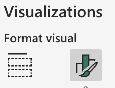
To add a title, select the ‘Title test’ drop-down, then enter the title you want into the Title Text field.
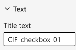
The title will appear above your slicer.
When you select a value in the slicer, you’ll see all of the visuals on the page update to be filtered for that data.
To save this new report, click ‘Reading View’ and then confirm that you would like to save these changes.
![]()
To learn more about how to create and manipulate visuals in Power BI, see Microsoft’s documentation on adding a custom visual to a report.


