Helpshift Analytics allow you to improve the support experience for users and optimize the workflow for your team. Every organization uses analytics data differently, so this guide is designed to walk you through the process of identifying which data is most important for your team and how to use it effectively to achieve your goals.
1. Dashboard Overview
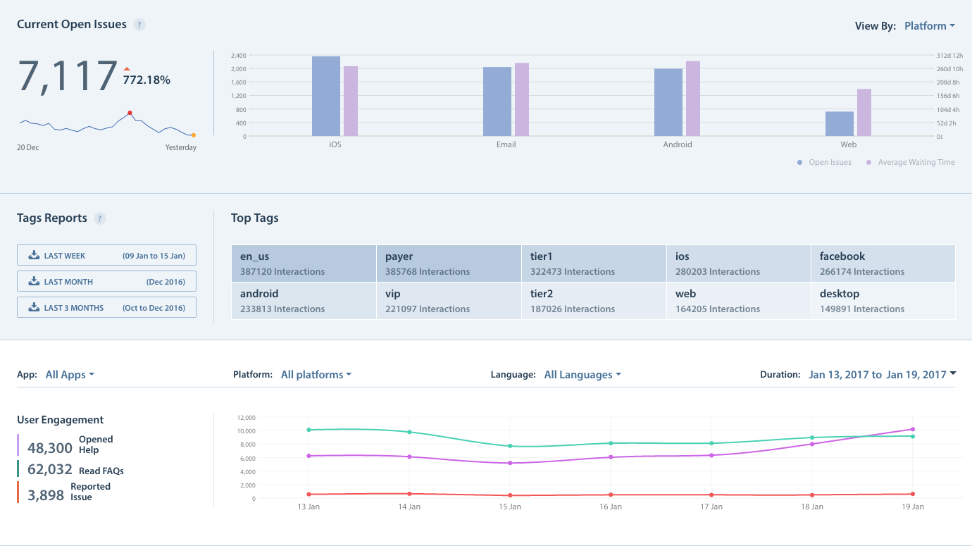
The Analytics Dashboard allows you to review metrics for each of your applications by Issue type, volume, and team performance. As the amount of Issues you receive increases, these metrics can help you track the effectiveness of your responses, FAQ articles, and individual Agents. When you look at the Overview Page in your Analytics section, you’ll want to focus on the top 3 sections: Current Open Issues, Tag Reports, and User Engagement.
Current Open Issues tracks the number of open Issues from the past 30 days. The top right drop-down menu allows you to sort these metrics by Platform, App, or Language. You can also hover over the columns to see the current amount of open Issues and the average wait time.
Tags Reports is where you can track the use of all types of tags: HS-Tags added to in-app Issues, tags added via Automations, and tags added manually by Agents. You’ll see icons on the left side for downloading individual reports on tag usage. This report includes only those issues which you create and update in the same week, month or last three months respectively. However, it does not include issues that you create last week and update in this week in the weekly report. Also, you can view the list of Top Tags which is automatically rendered on the right.
You can use this information to identify what types of users are writing in most often (paying, non-paying, VIP, etc.), what types of Issues are submitted (feedback, bugs) and any changes to your regular Issue volume. Structuring an organized tag system is crucial to using this data effectively. To learn how to work with tags, see How do I create and use tags? User Engagements provides information on how users have interacted with your Support tools, including how many of your users opened your Web Support Portal, read an FAQ article, reported Issues, and more. You can use the App, Platform, Language, and Duration drop-downs to review different sets of metrics.
The User Engagements area on the left has three prominent metrics listed by default: Opened Help, Read FAQs, and Reported Issue. A healthy Helpshift account will have the Read FAQs be 1.5x the volume of Opened Help. This means that users are reading multiple FAQs to find answers to their questions prior to contacting support. If your Reported Issues are 10% of Opened Help, then you’re deflecting 90% of Issues by having relevant content in your FAQs. Data on these tabs refreshes every 30 minutes. To learn more about what data is refreshed at what times, see What time do my Analytics metrics update daily? The Contact rate is also listed in this area. To learn how this is calculated, see How is ‘Contact Rate’ defined/calculated?
2. Evaluating Agent Performance
A wealth of information on Agent performance is available under the Team tab, organized into three areas: Trends, Summary by Agent, and Summary by Group. In the Trends area, you can use the drop-downs at the top to review metrics by Team members, Apps, Platforms, Languages, Dates, and more. The book icon leads to the Analytics Glossary where you can review Helpshift Analytics terminology. The cloud icon allows you to automatically download all of the metrics available for today.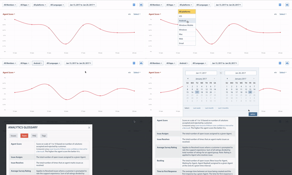
Under the Summary by Agents tab, you’ll see a list of all your Agents along with their Agent Score, Issue Assigns, Issue Resolves, Average Survey Rating, and much more. Click the arrows to move down the list and review additional metrics. The following metrics can be used to evaluate an Agent’s performance:
- Agent Score: A scale of 1 to 10 based on the number of solutions accepted and rejected by the end user. A higher score essentially means more users were happier with your Agent’s responses.
- Average Survey Rating: The average CSAT response for the Agent. Agents should aim to have their CSAT responses as high as possible.
- Holding Time: Average time between an Issue getting assigned to an Agent and when the Agent replies. This excludes New Issue Automations.
- Time To First Response: Time taken by an Agent to first respond to an Issue. You want to keep this number as low as possible to provide the best support experience.
- Average Time To Resolve: Time taken to resolve an Issue. Your goal should be to have a short Time To Resolved coupled with a high average CSAT score or a high number of accepted solutions.
- FCR (First Contact Resolution) Rate: Percentage of cases resolved with a single outbound interaction. This should be reviewed against the Agent’s Acceptance Rate.
- Acceptance Rate: A high percentage for FCR isn’t ideal when combined with a low Acceptance Rate.
- Outbound Interactions: Number of outgoing messages from a given Agent. A low number means your Agents are effectively resolving Issues with very little back and forth communication.
You can further filter this information by sorting by App, Platform, or Language.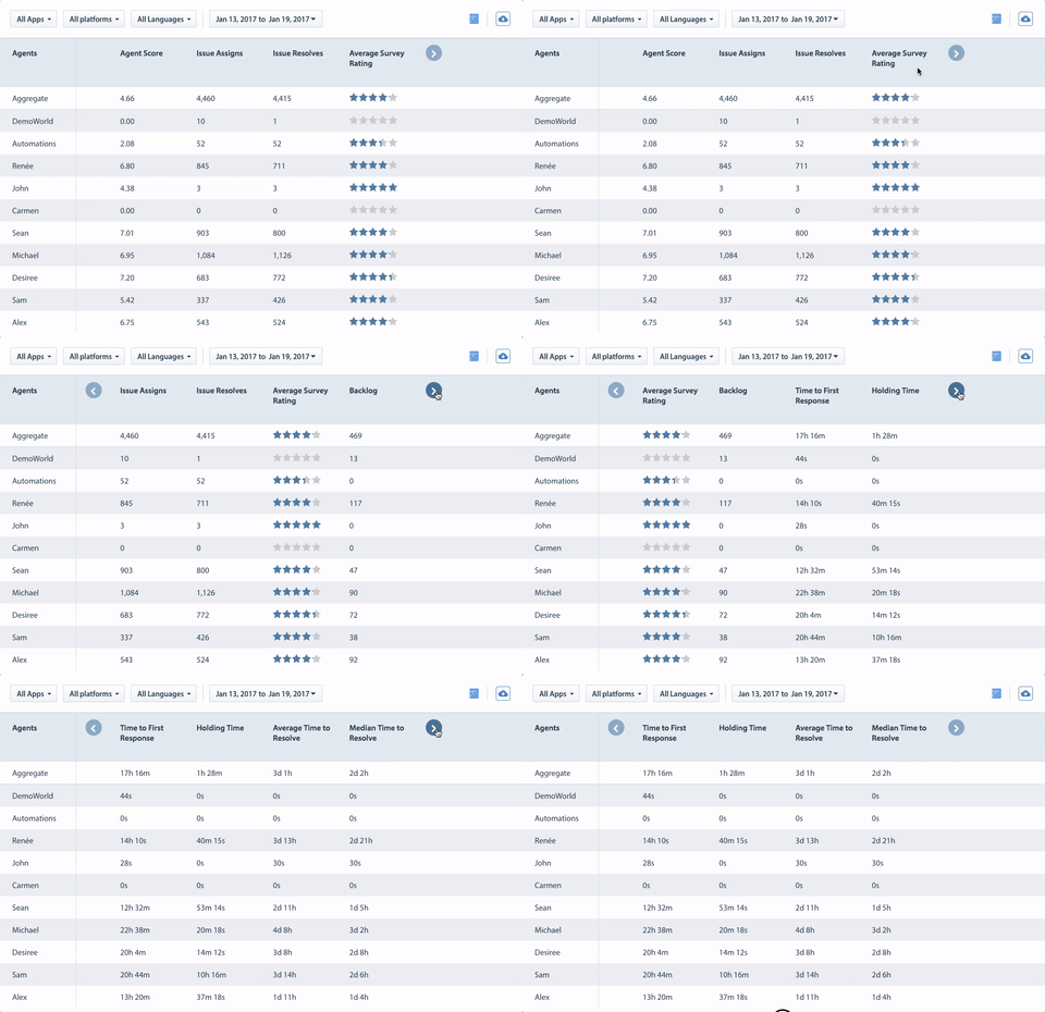
You’ll notice an exclamation point icon next to each Average Survey Rating. Clicking this allows you to review the number of Issues per each CSAT (Customer Satisfaction Survey) rating that is summarized within the average score.
You can also click on the rating numbers to jump to an Advanced Search statement that filters for those exact Issues. To learn more about this feature, see What is Advanced Search, and how do I use it?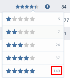
The last tab, Summary by Groups, allows you to review the same metrics for all Agent Groups you have created. If you’re not using Agent Groups, please see How do I create Agent Groups? to get started with this feature. Groups are a great way to prioritize VIP or high paying users, urgent technical errors, and other types of Issues to receive faster support. Some metrics you should use when tracking high-priority groups are as follows:
- CSAT score: Your VIP Groups should have a high CSAT score.
- Time to First Response: Because you want to provide the best experience possible to VIP users, your Time to First Response should be shorter than for other Groups.
- Holding Time: Just like with Time to First Response, Holding Time should be lowered for your VIP Groups than for other Groups.
3. Measuring FAQ Effectiveness
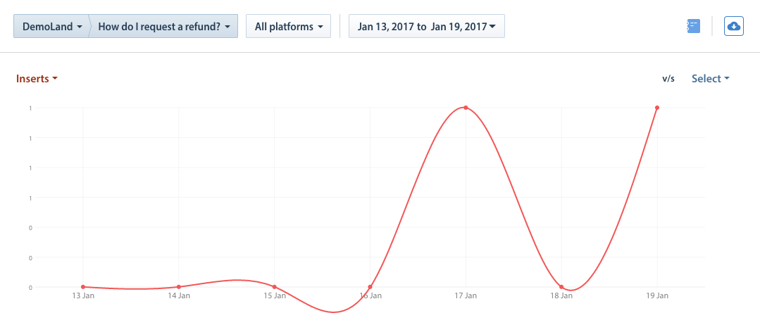
You can review information on FAQ effectiveness via the Analytics Dashboard by reviewing the tabs under ‘FAQ’. The data available here is divided into three categories: Trend, Summary by FAQ, and Summary by languages. For each of the three tabs, you’ll need to select an App, FAQ article, Platform, and date range via the drop-downs at the top of the page to see data for that FAQ or language. If no data exists for the selected criteria, the page will display the message ‘No FAQ data for selected filters’. Please note that all uses of Insert FAQ (even accidental or unsent ones) count towards the FAQ metrics. It does not filter based on sent or unsent status.
You can measure FAQ effectiveness as follows:
- Compare your top tags (on the main page) to the FAQ content associated with those tags. Since these are the Issues that your users are writing into about the most, this is where you have the most potential to deflect Issues through self-service and FAQs.
- Review data for FAQs articles and FAQ Sections. Because these are the topics you are receiving the most number of Issues about, consider whether or not it’s worth creating a whole FAQ section around a particular article rather than a single FAQ.
To improve your FAQs, see How do I create FAQ Ssections & articles? and What should I include in an FAQ article?
4. Comparing Data Across Apps
Comparing data across applications is helpful for identifying norms (metrics that are consistent across all of your applications) and identifying anomalies (metrics that only occur within one of your applications). Anomalies may be a result of an exceptionally excellent or poor support experience offered within a single app. Investigating the results of this comparison may provide opportunities to improve one or more applications to offer a consistent and positive support experience across all of your applications. To compare app data for Issues, Agents, Groups or FAQs, navigate to the ‘Trends’ page for each of those tabs. From there, click the drop-down at the top of the page that defaults to ‘All Apps’ and select a specific app. Once you’ve pulled up the app you’d like to compare data for, click the cloud icon on the top right to export this data.![]()
Repeat these steps to download the same set of data for multiple applications. Use spreadsheet software to delete any columns you don’t need and merge the different files into one spreadsheet. When reviewing this data, look for:
- Your best performing application: Identify what metrics contribute to success and what causes them to shrink or grow. Does your best performing app have robust FAQs? Is the team structured differently? Are Issues answered more quickly and/or effectively? Use this information to improve your other applications.
- Your worst performing application: Similar to your best application, identify what factors may be causing poor metrics for your worst performing app. Do you need to add more FAQs? Prioritize certain users or Issue types? Restructure the team that provides support for that application?
- Outliers: Whether good, bad, or neutral, consider which factors may lead to differences in metrics across applications. Does one of your applications typically incur more difficult types of Issues to resolve? Do you need to dedicate more support resources to a specific Issue type? Can you proactively offer support to prevent certain types of Issues?
To set up additional features and learn more about Helpshift best practices, please review our Knowledge Base.
